Wednesday, September 30, 2009

Ruler Drapery Drawing


completing this drawing was annoying. Primarily because charcoal is messy, and I miss graphite. However, it looks cool. And for once I actually like it better further away than close up.

I discovered using a smaller, clear ruler worked a lot better for me than a big, metal ruler, because it's less cumbersome and allows me to see through it to the other line to make it more accurate.

I feel like my skill with ruler drawings is completely different than that of doing perspective. Not to mention the change in medium. I mean, I understand there are similar things between them, just somehow this is way different to me and I don't think I'm as proficient in it. Practice practice practice!!

next week's assignment should be better.

Wednesday, September 23, 2009

Planar Analysis, Cowboy Troy


I turned in and was critiqued on my intuitive perspective piece. The critique mainly detailed line variation, in the sense that my lines need to be darker in areas. This is different from last week's line variation, however, since last week I made all of my lines too uniform in many places, and instead in this one, even if they do change, in many cases they should just be bolded to help bring the sense of space to a greater level, and help the chair become better grounded.

I was worried at first that it was going to be really time consuming and hard to create the same level of clarity within the subject matter with free hand than with the other perspectives involving reference points, since how many times has the eye tricked and something just looks off. Many people in critique had something here or there that looked off--and I wanted to avoid that. I believe I did, since no one mentioned anything.
The part I had the hardest time with was the floor boards, sense they really wanted a point but I didn't have one to give them. Overall, for the amount of trouble I had with them, aside from the fuzziness in places, they turned out directionally well.

So Cowboy Troy reminded me of this one skit from SNL with Andy Samberg, Ludacris, and T-Pain. This isn't related to drawing specifically, except for class today. So anyways, here's the link

Alright. Planar Analysis. I practiced it, and yet in class I felt like what I was doing wasn't coming out the way I wished. I think that was mainly because I need to become more accustomed to charcoal, and work a lot more on practicing getting the correct planes. Overall though, I think the finished outcome will look really cool--once I finally practice enough. But then again, won't my practice look interesting too?
This week's homework assignment looks like it has potential, drapery is interesting to draw, I haven't done it for a long time, especially not under the pretense of line quality. I'm really looking forward to next week's assignment, however, because the idea of mixing faces plus planar analysis I believe is going to come out with some really interesting results.

Wednesday, September 16, 2009

Thoughts on fourth week

Class today wasn't bad. The review wasn't scary, and critique was helpful and gave me a new challenge for next week (what will make drawing my living room... again, less tedious)

here's my piece, again, with a somewhat crappy photo quality:


During critique Jason told me that I could push my line variation within each line, and more specifically the book shelves could have a darker line on the right, showing the space better. The lamp could be darkened as to show it not being directly against the wall, although it is very nearly resting against it. Also, the space isn't as adventurous as my last piece. I agree with all observations.

My opinion of intuitive perspective is this:
It's challenging, and, liberating in the sense that one can draw anything they like and technically it should work, rather than being confined to a corner or directly forward plane. The challenge comes in when trying to get those perspectives correct, lines parallel where they need to be, etc. And so I'm interested to see the outcome of this week's assignment, for who knows if it'll turn out the same way as the others... I could just completely lose my eye and fuck everything up. Hopefully this will not happen, however.

I got my spot in mind, though. Don't worry, Jason, it's adventurous and hopefully will hold up this standard I've set for myself.

--

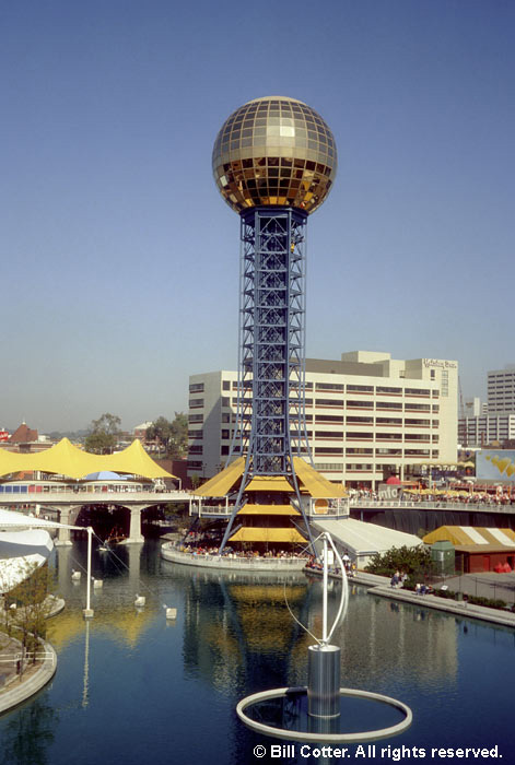
So we went over revealing shape through planes. And I was thinking about it... I have a perfect example in architecture.

The Sunsphere!! in my home, Knoxville, TN! It was created for the Worlds Fair which was in Knoxville, 1982.  Now it's got a restaurant and some space available to lease, another floor is offices for a newspaper called Metro Pulse and there's obviously an observation deck. But look at this, the sun sphere is a complete example of showing space through planes.. as that's all it is! glass planes.

Thursday, September 10, 2009

Third week of class thoughts

Here's what I turned in for my 1pt perspective drawing. I meant to get a better quality photo before I turned it in, but hopefully it won't be ruined between this week and getting it back next week :)
I'm happy with it. I agree with Jason that that line could be punched, now that I look at it. I'm not sure how I didn't notice it before, but it's easily fixed so no worries. I am particularly happy with the cabinetry. I think it turned out really well, and that plus the view into the kitchen are my favorite parts visually.


Three weeks in, and we're still drawing cones and boxes. This doesn't really bother me, though. Sure other things are more challenging, but I think foundation work is really good.. like I'm not just saying that, I actually enjoy foundational work and generally think I can always use more of it no matter how much I do.
Anyways, the critique didn't seem like the college "harsh" it was hyped up to be. I mean, the "baby gloves" or whatever Jason said that he put on sort of meant that he said he liked the piece and then went on to say about the same thing for every one, that they got the concept and needed to punch some lines, add some things on walls/floors to break up and define the space, or that they actually didn't do the assignment correctly. But the composition, choice of area, etc. wasn't really discussed.
I'm looking forward to a really good critique. Forget this taking things personally nonsense. Give me the straight forward so I can improve!

Two point perspective will be cool, I guess. I hope I don't get sick of drawing my living room after this assignment, since there's another one to do afterwards. I spent like 10 hours on the last one, so maybe I can speed it up and not compromise quality. We'll see!

Sketchbooks. Mine's looking okay, although something about there being requirements and it being checked for those and graded at the ends makes it harder to approach it for me. I'm trying my hardest to make it comprehensive, though, i'll just take it like the other challenges given. (bring it, grading scale!)

Sunday, September 6, 2009

Perspective

Here are some examples of 1, 2, and 3 point perspective that I have found.
These two examples are by a girl named Cotar Roxana, from Romania. 
This is an example of one point perspective
Here she has done two point perspective.
This next artist is named Robert M. Crum, and he's from Colorado.

Alright, so I know we're only supposed to find 1-3 point perspectives, but I found this and I think it's super neat- it's 5 point perspective. The artist's name is Andrew Laux, and he's from D.C.

This next drawing is by a girl named Abby Lee from San Francisco.  Her line variation is nice, aside from the point receding on the railroad tracks, her lines emphasize the depth well.
This is an example of 1 pt perspective.

This next artist is named Eric B. (couldn't find his last name..) , and he lives in the U.S.
How cool is this robot?

a great use of 3 pt perspective :) Plus, the line quality is nice. He's well grounded, and the lines get thinner as the robot goes towards the sky.
If I find more pictures later, I may add them.
As a note, all images were found on deviantART, and all images belong to their respective artists.
So as response to Jason, here's 1-6pt perspective. Imagine, 6 points!! I'm impressed.

Kind of hard to see. here's the link

Tuesday, September 1, 2009

First Assignment

The first assignment was surprisingly enjoyable. It's so simple--and yet so much can be done with it. I wasn't frustrated with the fact that the lines had to be vertical or that each stripe needed to be a separate composition. In my mind, this is all great! The overall composition of the entire piece looks cool because of these constraints. I'm happy with where it's gone, and I sure have become familiar with my line qualities.